

You must log in or # to comment.
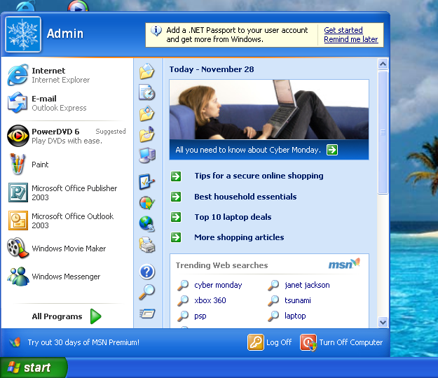
Look at how they massacred my boy…

Your username is a god damn lie, please fix it
Sorry!
That’s not nearly shitty enough. It’s too useful. Look at all the options and other clickable things you got on the start menu, and it only took one click to open it.
That’s not how this works anymore. If this were truly made today, it would be needlessly “streamlined”, i.e. everything is hidden so as not to “clutter up” the UI with useful things, and make more room for…nothing. Just wasted space.
We hide everything behind multiple clicks now because the “average user” starts bleeding out their eyes if they’re forced to see many things at once.
Also, icons. The icons in Windows XP are too recognizable. You need to minimalize them. In fact, minimalize it so hard that not one person could understand what the icon is even referring to.
Abstract art icons.
Folder: rectangle on its side. Start: triangle pointing up. Trash: rectangle standing up.
You could have shorted your comment. Now if you’ll excuse me I have to deal with this eye bleed.
Trending Web searches: Janet Jackson
lol
Whatever happened to her? I can’t even remember the last time I heard anything about Janet Jackson.
Where the crypto and AI bloat?
yea, where are pinned apps in the task bar?
That [Yes] [Remind Me Later] thing is so 2007…
Nowadays Windows features all have a definitive [Off] option, that will fully hide the feature from view and only enable a daily message that pops under your mouse so you can turn it back on any time you want.
Honestly if Microsoft reintroduces the skeuomorphic UI I’ll tolerate any bullshit they pull. It’s just objectively pretty IMO.
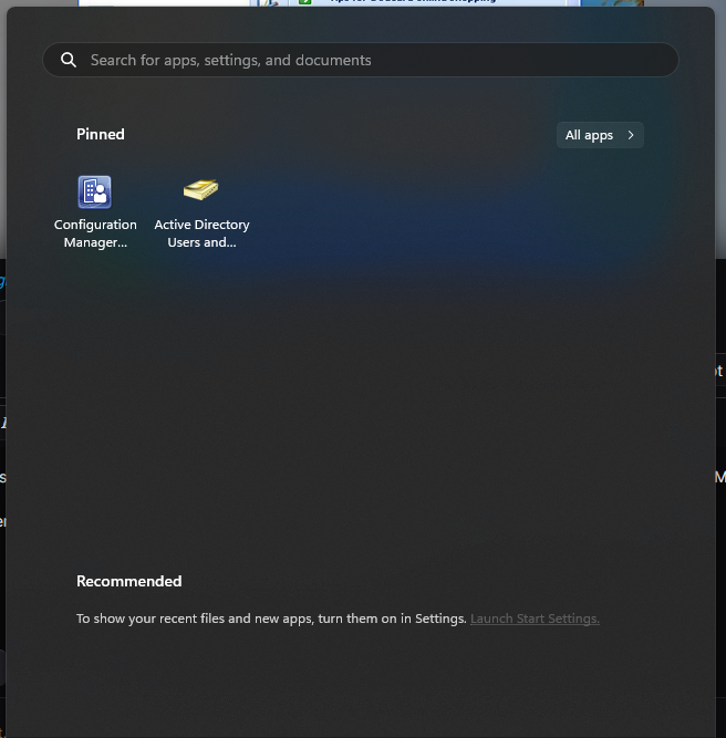
Also this start menu doesn’t have nearly enough useless negative space. Here is my work Win11 start menu for comparison:
I actually liked and used the old pull up menus in Windows. Starting at Win10 I put everything I use on my desktop and avoid as much of Windows functionality as I can and turn off everything I can. I don’t want an Android or IOS type interface on my PC and will go to Linux at some point as Windows pushes that envelope further, or switch to some WinServer type setup where they allow the owner a lot more control of the OS
TIHI
Reminds me of something…
WRONGGGG!! No one would be using an MS Office version that is 21 years old.


